In the last 10 days of my 8-week course, I was challenged to make a portfolio. I built my previous portfolio in the fall of 2023 using a free WordPress website.
And it looked crappy.
Which is not a great look for someone who claims to have a passion for graphic design.
These last 10 days in the semester were my chance to revisit my portfolio and elevate it from 4 static webpages into an engaging and visually interesting site that reflects the quality of my work, my blossoming knowledge of HTML and CSS, and myself as a “brand”.
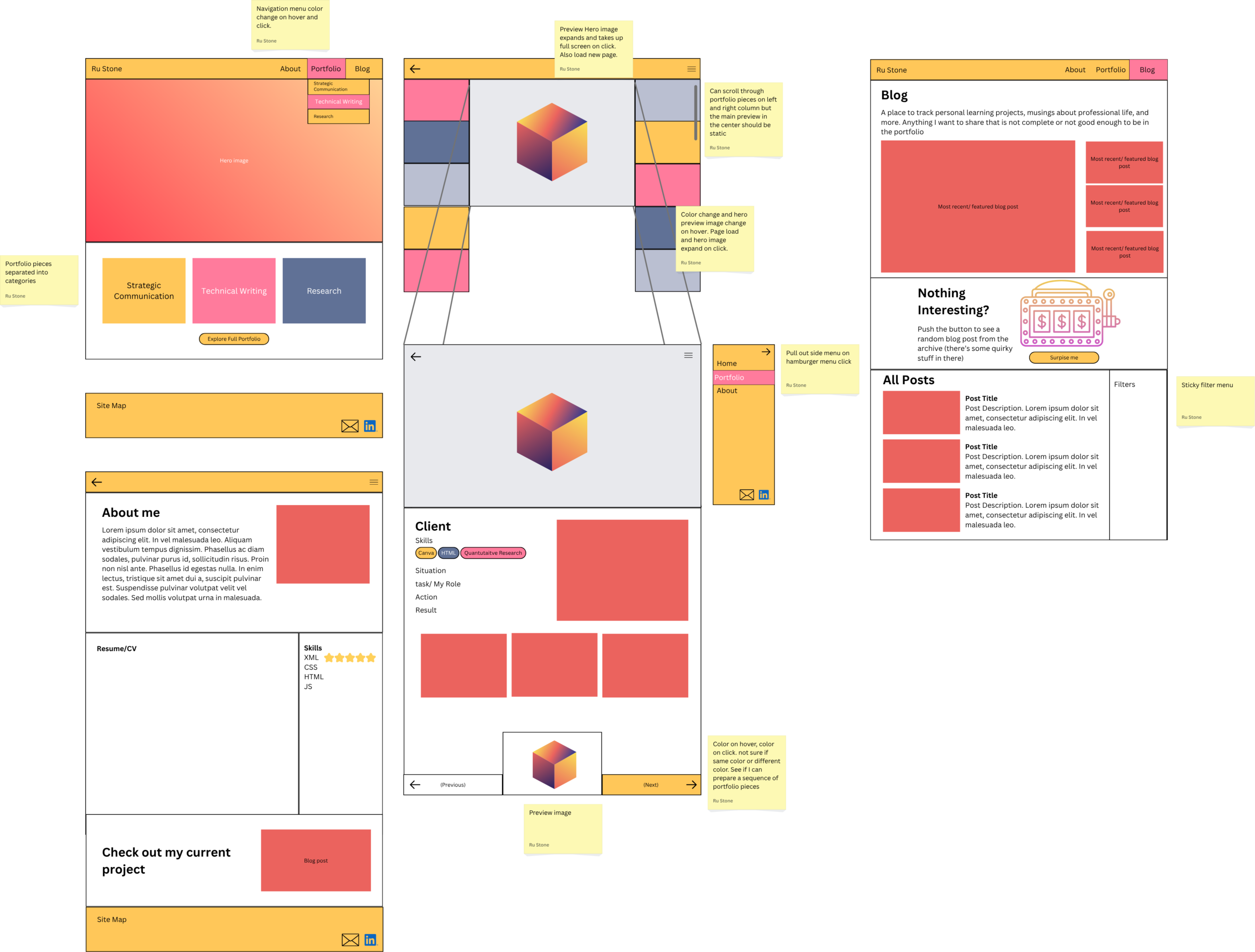
Day 1: Identify Problems & Get Inspiration & Design Wireframes
When I created my first portfolio, I knew there were some mediocre elements.
Problem #1: My portfolio was becoming too long.
I put almost all my work samples from college on one webpage under different headers. I eventually had the good sense to add a table of contents to the top of the page so that people could click to an area of interest, but the page length eventually became impractical and unattractive.
For this portfolio, I wanted to have a curated set of samples on a separate page.
Problem #2: My portfolio had a Resume page, but my resume was often changing.
Common advice for job hunting is to tailor your resume to the position. At the time, I was applying for jobs in market research, editing, graphic design, and teaching/tutoring and had resumes that highlighted each of those skill sets.
That made the static resume embedded on my portfolio feel outdated and inaccurate.
Problem #3: I hate about me pages.
Any time I have to write a bio for a social media, I feel like I’m lying. I never know how much personal to put with professional or where clever copywriting turns into cringe sales speak.
For this portfolio, I wanted to merge my resume page with my about me page and turn my resume into a comprehensive work history.
Getting Inspiration
Earlier in the semester, I looked at a few portfolios on Cofolio.com for inspiration. I didn’t find anything that I loved, so I took note of my favorite elements.
Luka Schulz’s portfolio had a cool tagline with an animation showing fun facts about him. I loved how it mixed personal with professional and instantly allowed the reader to connect with him.

Then, I looked at a collection of the best portfolios and found Peter Tarka’s portfolio and fell in love with the way he did feature images for each of his portfolio pieces. The only issue is that the feature image covered the title of the bottom right piece.

Finally, I went to coolers.co to find a color palette that reflected my energetic, bright, artistic, and multi-talented brand.
According to articles on color psychology, yellow and orange communicate energy, happiness, and brightness.
I decided to make pink the accent color because it also communicated brightness and had a similar saturation to the yellow, matching its strength.
The other purplish-grey colors would be used as tertiary colors.
With my inspiration and basic color palette decided, I took my favorite parts of each portfolio and put together a low-fidelity wireframe for the Home, About, Blog, and Portfolio pages.


Day 2: Building in HTML or WordPress?
I knew I wanted my website to be built on WordPress, but I’d used WP to build my previous portfolio and found it difficult to use.
About 2 months ago, I watched a LinkedIn Learning course on WordPress, but I was still uncertain about how much I’d be able to customize and whether I could get the look and feel I wanted.
I figured I could build the raw HTML structure, CSS, and JavaScript externally and import the files into WordPress… unfortunately, it wasn’t so simple.
After googling, it seems my main options were to create my own theme or customize an existing theme. As someone who was not a CS major, I had no idea how .PHP files work and had a limited timeframe to make it work. So I tried a hybrid approach to build the most difficult custom element– the pop-up in the center of the screen.
I knew enough HTML and CSS to generally get started and did some research on potential methods including using an iframe and JavaScript to change the source or using classes and CSS to show an image on hover.
I ended the day with a working prototype using the CSS hover pseudoclass.

Day 3: Integration Problems
After the success yesterday, I figured I could just import a .html file, but when I looked at how to place it into WordPress, it seemed more complicated. After some research, I found out there was no easy way to directly import files.
The best I could do was import the files from my old portfolio into the new website, which gave me a foundation to work from.
Next, I decided to recreate the HTML using WordPress blocks and would add enhanced functions if I had time.
I built the major structure from my wireframe for all my pages using pre-existing patterns and blocks and added my custom color palette into the styles panel and customized some of the major blocks, like the header and footer.
Day 4: Where is the CSS???
Over a couple of days, I prodded and challenged WordPress’s customization limitations. Eventually, I found the Styles menu (it took way too long to figure out where it was and how to add classes and IDs to the HTML) but still didn’t see a place to put in custom code.
WordPress is intentionally beginner-friendly, but that means it can have limited advanced functionality for customization.
After more googling and looking for recent videos that matched with the current WordPress version and layout, I learned where to place custom CSS, how to assign classes to the block elements, and where to add custom CSS for existing elements.
I was frustrated at times knowing I was working on a deadline and feeling like I couldn’t present the web experience I wanted. I found myself longing for the HTML syntax I was used to.
Day 5: Plug-in problems
As seen on my wireframe, I wanted to add a filter for all the blog post pages. With some research, I tried the Filter Everything plugin.
The problem, I soon found out, was that the free version doesn’t allow for filtering part of the page and didn’t seem to integrate easily with WonderBlocks.
With my due date looming, I decided to settle for the blog archive block.
Another goal was to have an interactive button on the blog page to display a random blog post, but this would likely require custom JS, which is difficult to implement without another paid plug-in.
As the number of blog posts grows, both these enhancements might be worth revisiting.


Day 6: About me
I spent most of my work time finalizing the About page.
I stylized the CV section to look like a piece of paper, added the colored categories of skills, and inserted a placeholder for the customized CSS featured image.
I also added some scroll animations to make the page a little bit more dynamic and made the skill categories a sticky element that readers could refer to when looking at the list of skills used in a specific experience.


Day 7: Writing Content
One of the annoying parts of WordPress is switching between pages and how long it takes to load. Instead of writing directly on the page, I made a document with each project and wrote out a sentence following the STAR method.
This made it easy to copy and paste the text into the pages and blocks.
Day 8: Custom CSS
The last big challenge I wanted to tackle was adding an attention-grabbing CSS animation to the Home page and About page.
I liked that the typing animation matched my work as a technical writer, so I found a YouTube tutorial explaining how to make the effect in pure CSS.
Once I had the structure, I adjusted the style and colors to match my personal brand.

Then, I created blocks for the portfolio page and figured out how to add a hover effect for a custom class.
Although it was straightforward to get the blocks to look right, there was a WordPress limitation for adding a link to a div block. Fixing it was as simple as manually adding an <a> tag in the code editor, but it meant the visual preview was no longer accurate.
Day 9: Going Live
At this point, the deadline is imminent, and most of what I had to do was place content and make sure everything was uniform.
I brought in old assets from my previous website, created a new home page hero image, made sure the pages were uniform, updated all the links, and added a logo.


Day 10: Just the Essentials
Like any good project, I did not finish the full revamp of my portfolio before it was due.
I got enough pages looking decent to submit for my assignment
Although the project still has some advanced functionality that will still take some work.
But for now, I can finally get a full night of sleep.